It’s Christmas!
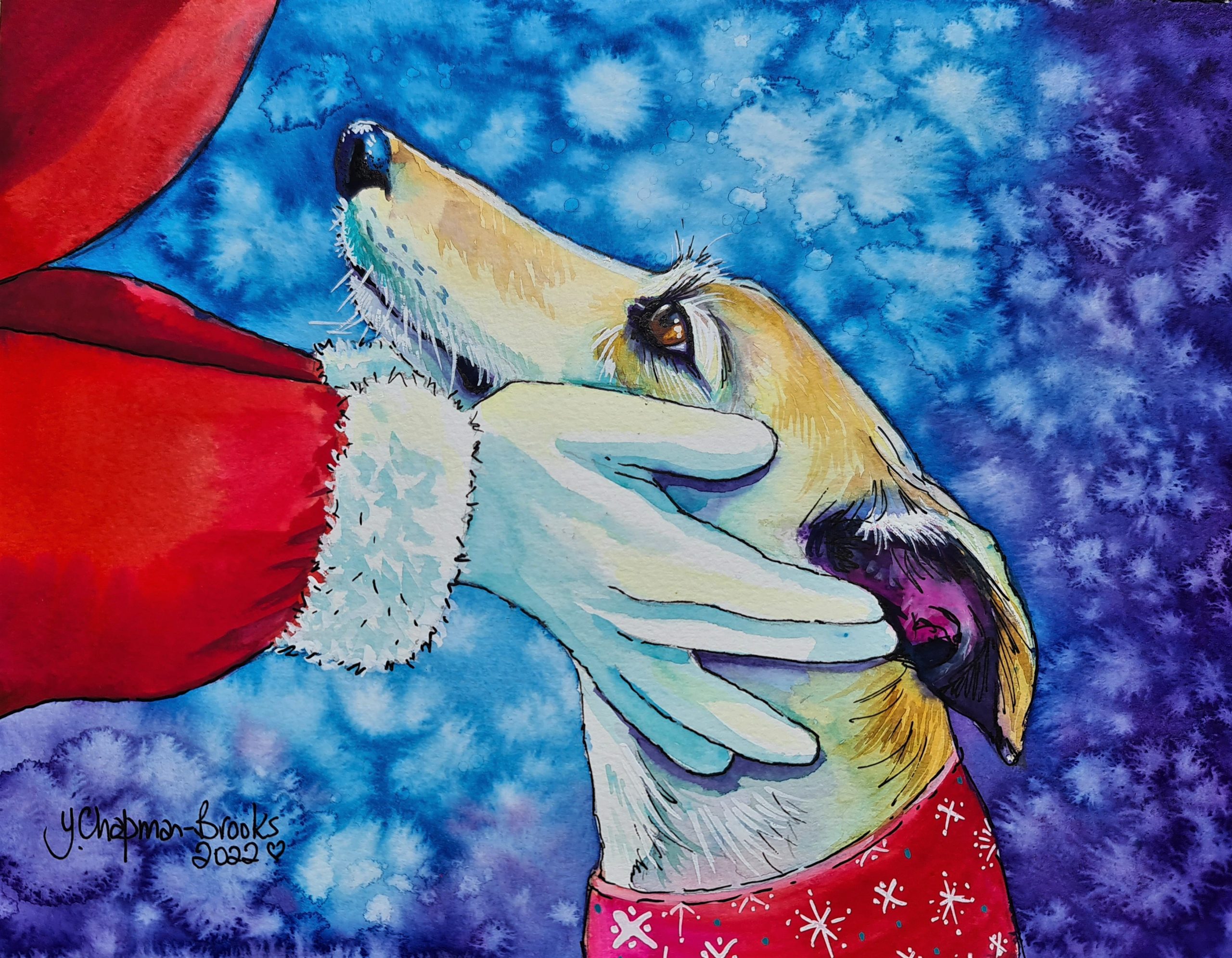
Let us celebrate with a card or two! It’s that time of year again and once again I have designs for my colourful Greyhound watercolour
Let us celebrate with a card or two! It’s that time of year again and once again I have designs for my colourful Greyhound watercolour
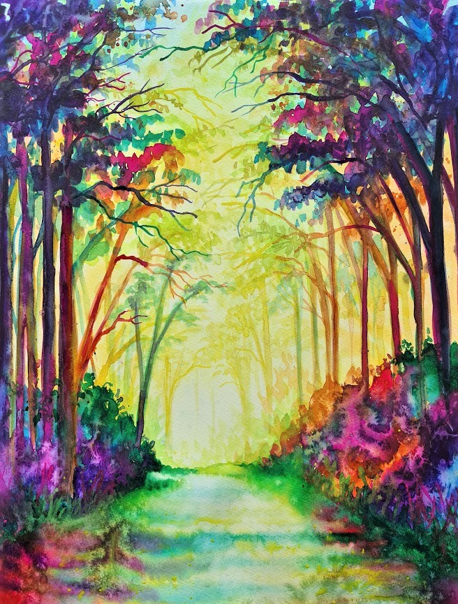
MAKING A LANDSCAPE I love doing watercolour landscapes using the bright rainbow colouring, using the warm (light) and cool (Shadows) colours. I start very basically
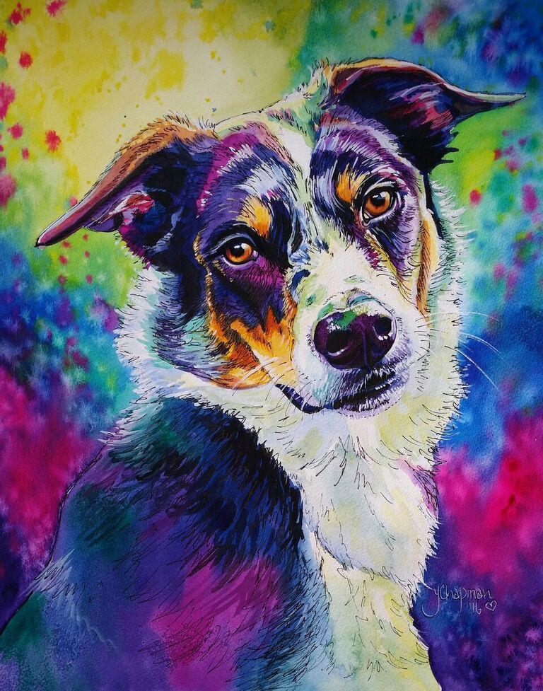
Back in 2016 I was approached by a lady asking for a commission to be painted of a beautiful dog called Bizzy. Tragedy had struck
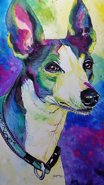
A Greyhound called Blue It is well known that I love Greyhounds, I am lucky enough to have two of these beautiful dogs in my
It all starts with a good clear photo, one where the subject is not blurred, not too far away in the photo and preferably in
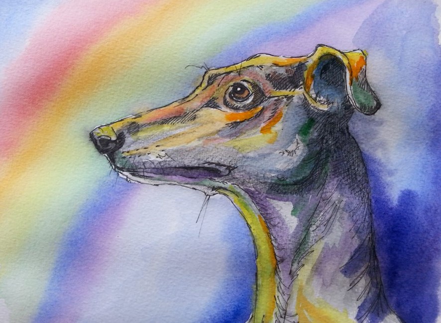
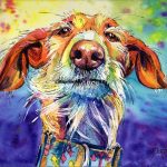
I used to avoid using watercolours, thinking they were boring and “wishy washy”, so my early portfolio consisted of Pastels and Acrylic paintings. I used