Blog

A look back over 2024

Well as we say goodbye to 2024 and hello to 2025! I would like to wish you all a very happy New year. Thank you all for you continued support for my artwork, and for those who entrusted me with creating a loving memory or portrait of your pets, (several this year went overseas to the USA) A big thank you to all of you. As I look back on the last 12 months we have seen some sad changes in the Brooks household, the main one being the loss of our beautiful Greyhound, Daisy. Daisy was my muse for over 11 years, and she will be greatly missed. Luckily, I have several paintings of her dotted around the house, along with Otis who we lost at the end of 2023, so they will always be looking over us. The last year started with my shoulder surgery which meant no art for nearly 4 months, then the creation of my art quilt for the Australian Quilt Challenge “Oh my stars” where my quilt was selected as a finalist to tour the Eastern States.  It has now returned and is hanging on my wall alongside “Saving Magic” It is great to see them daily hanging together. I ran a couple of workshops last year and will be planning a couple for this year too. Watch this space or follow my Facebook page for details. https://www.facebook.com/@YvonnesArtwork/ Cossack Art Awards this year was another good exhibition for me too, with a sale and a Pilbara Ports People Choice award, for “When the working day is done,” that was a wonderful award to win and one of my best paintings for the year. It is too hard to choose a best piece or best portrait as I love doing all of them.  I have a couple to do for the New year, and a few for home and for sale at the cellar door at Vineyard 28 I look forward to sharing them with you on my website and on my Facebook page. Have a very safe, prosperous, and healthy 2025 everyone.

Read More »

Watercolours: Lets start with the basics part 2

What to consider when buying watercolour paper PAPER When you start watercolour painting there are so many things to consider, paper becomes a personal preference as to make, surface and weight.  The traditional and most common paper to paint on is Cotton, or cotton and wood pulp (known as RAG content,) these make up most of the papers, but also bamboo and agave are becoming popular. Watercolour paper is heavily sized. This sizing is like a glue that seals the paper and stops its surface absorbing all your paint. Artist quality paper has good archival quality meaning your painting will last. There are different formats available: sheets, pads and blocks. Sheets need stretching, using watercolour paper tape, and can be cut to customised sizes. Pads are usually spiral bound or gummed on one edge, pre-cut to a certain size. Blocks are gummed on 4 sides with a small opening to remove the page once painted, these don’t require stretching and will remain flat when the image is dry.  They have less sheets than the pads but give a stretched paper finish.  Stretching paper prevents the paper cockling (buckling) when dry, it will stick cockle while wet but will dry flat, unstretched paper will cockle and this will remain as the painting dries. WEIGHTS OF PAPER The weight of the paper is important.  Watercolour paper is mostly made in different weights, shown here in gsm (grams per square metre for metric), or British imperial lbs (pounds per ream) The weight indicated on the paper pack or pad is the weight of a full ream, so 140lb is the weight of 500 sheets measuring 22” by 30”. 190gsm/ 90lb, 300gsm/140lb, 425gsm/200lb and 640gsm/300lb. 185/190gsm is thin and needs stretching, 640gsm is similar in thickness to card and therefore doesn’t usually need stretching.   In summary, and as a rough guide, I recommend that paper of or under 140lb needs to be stretched to avoid the paper buckling. PAPER SURFACE What the difference is between NOT, hot pressed & rough papers?  These terms refer to the surface of the paper and its texture. Hot pressed papers have a smooth surface made by passing the paper between two hot cylinders. Great for lots of very fine detail such as botanical paintings.  Cold Pressed or NOT (as in not Hot Pressed) papers have a slightly textured surface which is great for most types of painting.  Rough the roughest surface. This surface is great for painting landscapes where a more textured finish is required. Telling the front from the back of your paper sheets can be difficult, however if your paper has a watermark, it will read correctly on the right side when held to the light. Usually there’s is little difference and either side can be used, but the right side will have more “tooth” or texture. Not every make of paper is the same and you will find a paper you prefer and a weight you are comfortable with. Stretching your paper You will need… a board (MDF 9mm thick is a good size) large enough to take your selected piece of paper. Paper, watercolour  paper, ( as a rule paper over or around 600gms does not require stretching) watercolour stretching paper tape, gummed on one side and easy to tear, KEEP AS DRY AS POSIBLE when stored! Clean sponge Cold, clean Water How to …. Dampen the board by wiping with a damp sponge. Tear selected lengths of tape to fit your paper with overhang, Check your paper for the correct way round, look for embossed paper marks or watermarked name. Soak your paper well on both sides, you can use a hose or watering can for large pieces, or for smaller pieces a sink/bath of cold water, submerge your paper. Drain the excess water slightly. Place paper evenly on the board, some buckling will happen, try to keep it flat but don’t pull the paper flat, or try and smoothen out the buckles.  Dampen the tape with a wet sponge. Don’t soak it, just LIGHTLY wipe with the sponge, don’t rub hard or you will remove the glue. Place the tape so half its width is over the edge of the paper and press down, do this for all four sides. Leave somewhere warm to dry. It should dry nice and taut/flat. To remove your painting from the board when finished, run a cutting blade halfway through the brown tape where it covers your paper, if you give yourself a 5mm margin where there is paper behind your tape, you will find the tape stuck to the board will remove easily .  Excess tape can be removed by soaking it with water, then using a scraper remove the softened tape, wash the board with soapy water to remove the glue, let the board dry.  You are now ready to stretch another piece of paper.     

Read More »

Watercolours: Lets start with the basics

Usually just a few good brushes will do, the choice is split into Synthetic or Natural hair, personally I prefer the synthetic, they are cheaper, easier to replace and work well for watercolours. I find the synthetic holds its shape well, and the hairs are slightly firmer than the natural hair brushes. Natural hair brushes hold larger amounts of water and are great for mop brushes. Natural hair brushes are more expensive, BRUSHES ROUND This brush is very versatile, comes in a good range of sizes and is the one most often used, the round refers to the round profile at the tip of the ferrule, the metal bit before the hairs…and they taper to a fine tip, ideal for detail.  by applying pressure as you paint you can spread the brush hairs to widen the stroke.  (You can create fine detail with any size brush if you have a nice fine point, so you don’t have to us the smallest brush available to create small fine detail.) Mop brushes or Quills Great for painting very large areas or wetting areas for wet-on-wet applications. Quills have extra large, round body of hair that tapers to a fine point. Mops have densely packed hairs in a rounded shape. Riggers or Liner brushes Riggers are similar to rounds but have much longer hair. They’re perfect for painting long, fine lines. You need more fluid to create a longer stroke. Flat/Chisel or Filbert Flat brushes can be useful for covering large areas or for creating angular strokes. Use the large flat side of the brush for the best coverage, or twist to use the edge of the brush for thinner lines. Filberts have a similar profile to flat brushes. However – instead of having quite sharp, defined edges at the tip – they are gently rounded. Their oval shape creates a round stroke useful for painting petals and blending. Fan Fan brushes have tips where the fibres fan out into a canopy formation. They’re great for painting special effects, (Foliage or grass) creating texture.   PAINTS These come in either tubes or pans, student grade or Artist grade. Tubes are good for larger areas; pans are good for travel or smaller areas. Student grades are cheaper, have a smaller range of colours and contain cheaper pigments or artificial pigments rather than the cadmiums and cobalt, found in artist grade. There is a huge difference in price, but I find the Windsor and Newton Cotman range has good colour vibrancy and a good range of colours. The word HUE after a colour means it’s a cheaper pigment used to create the same colour. Artist grade is more expensive, has a wider choice of colours and uses real pigments, they come in “series”, ranging from 1 to 4 or 5, 1 being the cheapest, 4 or 5 the dearest purely because of the pigments and minerals used, e.g. Cadmium and Cobalt. These paints tend to go further, are more vibrant, and are smoother in texture. Opacity Each colour has a level of transparency, affecting how it will look with other colours, for example yellow is very transparent, layered over or under red will make that colour more Orange.  Some tubes in both watercolour and acrylic paint will have symbols on the tubes to depict the transparency. An empty square or circle = transparent A Half-filled circle or square = semi-transparent A solid circle or square = opaque. Permanence rating and Lightfastness Referring to the amount of fade over time in museum conditions. AA = extremely permanent A = permanent B = moderately durable Lightfastness is usually I or II (I is the lowest) and refers again to the amount of fade over 100years in museum conditions, both numbers are considered good for Artists.

Read More »

My Art Journey begins

London Road School of Art and Design, Northwich, Cheshire My art journey begins as a teenager ready to leave school after my O’ levels in 1978, I was interviewed by our school careers advisor.  He asked “What was my typing and shorthand like?.” Pretty rubbish, “So what did I think about hairdressing?”  Was this it… secretary or hairdresser…was this all a Grammar school Careers Advisor could recommend? “What was I good at? What did I love doing?”  Well that was easy, Art… loved it! I had been creating art and craft all my life, thanks to good old “Blue Peter” and “Vision On”.  Valerie Singleton and Tony Hart had a lot to answer for regarding my love of art. “Well… go to art school then! Here’s some numbers to ring and the names of people to speak to. Bye. Next!” So I went home, not offended by the lack of enthusiasm of my careers advisor, but with ideas of going to art college. On the final School Parents evening Mum asked my art teacher if she thought I’d get in to Art College, she replied “Oh yes the standard’s not that high!”well obviously my standard got me though the interview,  So London Road School of Art and design, Northwich,  Cheshire… here I come!I attended a 1 year Ground Course, where we covered everything, art, design, 3D design, woodwork, metalwork, photography,  ceramics, printing, and life drawing. I took my A level art a year early and passed.This lead to a second year at London Road on the  on the Foundation Course, covering everything again in more depth and with art history added. It was a great 2 years. I learnt so much, more than I ever imagined I could do. I loved it. The lecturers were amazing, approachable and enthusiastic.  This course prepared me for Polytechnic.    Coventry Lanchester Polytechnic Art and Design building Priory Hall student accommodation, Coventry Lanchester Polytechnic Coventry Cathedral UK I decided to study Graphic Design, against my tutors advice, he wanted me to go for 3D design, but I was accepted to my first choice Coventry Lanchester Polytechnic.  I was born in Coventry so felt I was going to a place that meant something to me, and the course looked promising.  I was living on the top floor of the Priory Hall G block, one of three accommodation blocks. I had great views over Coventry and the swimming baths behind. we were right opposite the Coventry Cathedral ruins, Bombed during WW2, and the new Cathedral. The next 3 years went in a flash. I made life long friends and learnt skills that I would use throughout my artistic career. I think perhaps a fine art degree would have been more suited to me, as I found graphics very rigidly structured and to me,  claustrophobic.  I didn’t always create  typical “Graphic Design” projects and was not encouraged to colour out side of the lines as I thought outside of the box, as it were.   I found a few of the tutors unhelpful in comparison to my foundation  course, they were hard to please and to find having set the brief, then disappeared. By the end of my 3 years I felt rather lost and disillusioned. One thing it did do was teach me a myriad of drawing, illustration and technical skills. The course covered computer design but using punch cards. It was 1980, no computer involvement in the design process in those days. I didn’t do very well at that part of the course. There was no quick way to print either.. we had to  hand set our typefaces for printing, we had Typeface books with different size type face so we could trace words on to layouts. We learnt about using ems and ens, point sizes and spacing, plus hundreds of typefaces to think about. It wasn’t easy, but I remember a sense of achievement when you saw the printed page., until you noticed a letter the wrong way around….I  passed my 3 year course with a BA(hons)  Unfortunately in 1983 jobs were scarce. In 1985 I swapped career paths and started a State Registered Nurse training. I dabbled with various art and crafts throughout the next few years, and emigrated to Australia as a Registered Nurse, with a good hobby. Unfortunately my health meant I had to stop work,  and art became my lifeline and my saviour. I think my style now is best described as illustrative, and the skills I use today were definitely founded in those 5 years study at art college.  I now teach art to a small group of ladies, and do my commissions and workshops, If I had my time again I would have gone on to do my teaching degree, straight after my art degree, and looked to teach art at polytechnic or university.  I have the best hobby I could ever wish for. I found that animals were my best work, and I love peoples response to commissions I do for them. My style has adapted over the years, it means I never get bored. I always have something I can do to fill my time, that is fun and rewarding. 

Read More »

Paint Your Pet Workshop July 2024

Well another successful pet portrait workshop completed.. I love doing these workshops, everyone produces such great artwork. It reminds me of why I paint in watercolours this way,  and why I  teach  others my technique and colour theory. Everyone interprets this lesson differently, and everyone creates wonderful artwork, and it’s a delight to see them go home with wonderful images. Some come to my workshop unsure if they can draw, or having never painted before.  In the workshop they are taught the advantages of using a grid to enlarge the chosen photograph, this makes the first part so much easier. It  is a simple, yet valuable tool. You can draw any image to any size you want, even reduce it, if you want to. The hardest part is definitely getting their heads around the colours they will be using over the next day and a half.   The background gives the students a chance to experience the colours and how they mix, or in some cases, how you don’t want them to mix. (Bengal rose and greens don’t make a nice colour, browns and blues will go grey) but used in the right order the colours will blend beautifully.I demonstrate using a black and white subject if I can, in these portraits the colours can  go totally against the grain. For example,  black is made of  blue, green, pink, purple and indigo.  For tan,  or brown colourings, I demonstrate with the individuals  portrait, using Australian red gold, burnt sienna, pinks and purples and the beautiful quinacridone sienna.  The workshop is held over two days, first is drawing and background, second is painting the subject.  Towards the end of the second day there is a section where I cover eyes and noses, as there is a special way to tackle the eyes to get that reflective, glassy look, and noses can be tackled in a series of layers. Finally the ink penwork and final whitework, (dots in eyes, highlights on the nose, whiskers etc) all done in the last 10 minutes.  Here are 5  portraits, my demo piece of Shadow and Charlotte is last.  If you would like to be included in one of my workshops, drop me a message. I hold around 4 a year. Space is limited as I only take 6 students at a time.   

Read More »
For Wilma

For Wilma

For Wilma, a beautiful senior Greyhound who touched my heart . In 2015 I was developing my watercolour style and my Rainbow colouring palette.  I was producing a painting for a friend in New Zealand, Tracey, who had a Greyhound called Wilma. Wilma had been rescued as a senior  and was afraid of everything, but with Tracey’s help Wilma slowly began to trust. I had just adopted Daisy so we had greyhounds in common, we were both new to Greyhound rescue and were discovering more and more about the Greyhound racing industry and these amazing dogs.  Tracey, appalled at how Wilma had been abused,  dedicated her time to uncovering the murky truth behind the Greyhound racing industry, and found that the abuse and mistreatment, drugging and killing of greyhounds was rife throughout the industry.   Tracey opened a Facebook page Called “Saving Wilma.  – slow, broken, old, Greyhound Racing’s dirty little secrets” and held fundraisers, raising money and awareness for Greyhound rescues. I painted portraits of Wilma for auction, and gave away portrait vouchers to raffle. The fundraisers were huge with a world wide following.  I was following a page by Paul Croes,who is based in Belgium and has produced some amazing animal photography.    Paul Croes- Behind eyes- animal photography in  studio He photographed sighthounds in the most exquisite poses, and I asked If I could paint one of these poses, a white Galgo, as a subject for a fundraiser. He very graciously said yes! I started this portrait as a prize for the auction, and while painting got the awful news that Wilma had died.  This was such sad news, she was the gentlest dog and had only just begun to have her own sweet life. I decided to name the painting after Wilma, and hinted at wings in the background.  This has been one of my most popular images, and is available as a print from Print Art NZ https://www.artcollective.co.nz/product/for-wilma/  I was delighted at the response from the public regarding this painting. In my heart it was for all the fallen Greyhounds, but it will always be a reminder of a sweet old girl from New Zealand called Wilma, who became a well known name in the rescue of Greyhounds, and in whos name, thousands of dollars were raised to help other rescues around the world.  Since painting this portrait, I have donated portrait vouchers to many rescues and fundraisers, and had the delightful task of painting some amazing animals over the past years.  I hear some sad stories, stories of triumph over adversity, and hear of heartbreak as a beloved pet dies. I love painting these portraits for you, it is such an honour to be asked to create a memory, even a sad one, and  tears are the best compliment I can be given, it means I got it right. 

Read More »

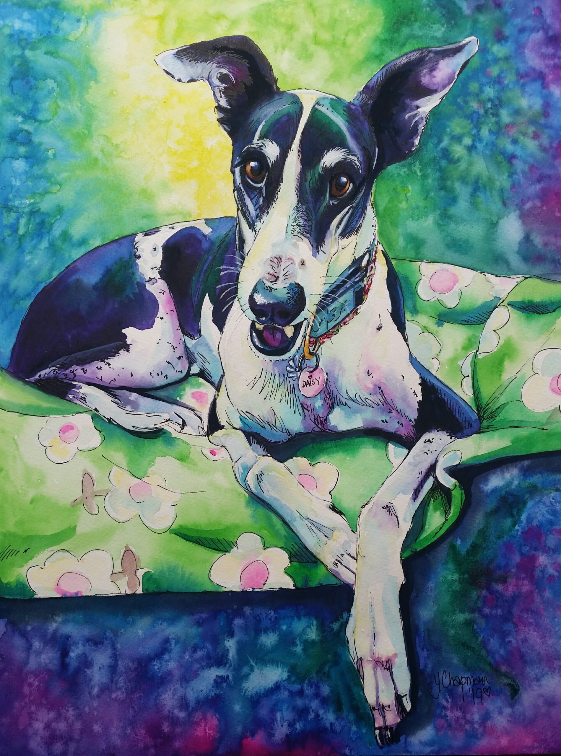
“It’s Time.” Goodnight Daisy

“It’s Time” Goodnight Daisy. Daisy was my introduction to the wonderful world of rescued greyhounds.  I adopted her through GAP, Perth, when she was just a little over 3 years old, she was tiny, weighing just 19kg.Her story to this point had its ups and downs, she had raced 4 times and didn’t place as she didn’t like getting bumped, so she ran wide. Daisy went into the GAP rehoming program, and was part of the Greyhound Prison Rehabilitation program, where inmates train and help the greyhounds get ready for adoption. Daisy was adopted by a couple, but unfortunately, was not treated well. This sweet little Greyhound  was very emaciated, very withdrawn and covered in fleas, they dumped her back with GAP saying they “Couldn’t be doing with her.”Daisy went on to a couple of foster homes, but was reactive to cats, rabbits, chickens and birds.  I had just lost Max, a Border Collie cross, and was looking for a companion for our Labrador Cross, Harvey. I took Daisy as a foster. This poor little girl was so tiny, I  nicknamed her my “little bird,” as she felt so fragile. She was beautiful  but had the worst breath imaginable.  Her teeth were so rotten, her gums terribly infected and ulcerated, and she must have been in terrible pain when eating. I asked GAP, “What do we do about her teeth?” I was told “Nothing until she’s adopted! “I was horrified, how long had this sweet girl been in such discomfort? This was so cruel! I adopted her there and then, and took her straight to the vet. She took 6 weeks of treatment, steroids and antibiotics, before they could do any dental work, and slowly, over the years,  her teeth were all removed,  bar 1. If I had known then what I knew after all her teeth were out, that she could eat really well, I’d have done it sooner. As a direct result of her terrible dental care in early life,  Daisy developed  severe cardiac problems.  Daisy was a happy girl, very easygoing, dainty and quiet. I was lucky enough to be in her life for 11 and a half years.  Daisy and Otis, my other Greyhound,  were  seen at greyhound adoption meetings, and were a brilliant ambassador for the breed. I loved their elegance, the way the ran for fun, their crazy zoomies around the garden, and hours of couch surfing. Daisy became my muse. Several paintings of her graced my walls, she was dainty, sleek,  a stunning subject. Through Daisy I became involved with several Greyhound and dog  rescues, donating artwork for Auctions. My commissioned art work became popular within the greyhound, and Sighthound groups.  I didn’t realise when I fell in love with Greyhounds that I had joined a cult.  Daisy died at 14 years 4 months. Longer than ever expected considering her severe heart failure.  She surprised us and out lived Otis by 10 months.  Once again my heart was broken, but we did give her the BEST life we could, and she repaid us tenfold.  I painted “It’s Time” before she died, when she was quite ill and it was obvious time was no longer on our side. I knew that once Daisy died I wouldn’t be able to paint her. I chose to paint her this final time, depicting the moment she leaves for  the Rainbow Bridge.  Her face alert and intrigued,  her body just starting to disappear into the light. And just like that….She has gone….. Daisy, my “Little bird,” run swift and free sweetheart, you were so beautiful. We walked some happy and amazing miles together.  Between Hello and Goodbye there was so much love. 

Read More »

Molly’s Story

This is the story of how were adopted by a beautiful white Boxer dog, and how she loved life and everyone in it.   Years ago, we were having dinner with a family that friends knew, who lived in a big posh house with flashy, very expensive possessions, which they liked to brag about, and who owned a white boxer puppy, her name was Sassy.  We found out later that she was a Christmas gift for their very spoilt daughter, who had got bored when she was no longer a cute little toy.  There was no indication that a dog even lived in this house, no dog bed, bowl, toys, nothing, so I asked the host where this dog was, as I had never seen a white boxer before. She led me outside to the garden and by the shed was a 9 month old dog, certainly not white, more brown and filthy, on a 1 meter chain so tight it was starting to embed into her neck,  and sitting in the doorway of the shed, she had obviously been there for a long time as the 1m space around the doorway was absolutely disgusting, faeces everywhere, old urine stains and stench, and a half empty filthy bucket of water. Her story was that “she’s a digger” and to be taught a lesson was tied up in disgrace!  No! she was a 9-month-old puppy who was being neglected and abused. She was absolutely delighted to see someone …anyone… and jumped up as far as her chain would allow,  her tail wagging furiously, covering me in old faeces and urine, my heart broke. I went inside so angry with how this dog was being treated, and said that we were leaving. On the way home I cried and told Jeff, my late husband,  about this poor dog.  Early the next day we had a phone call from our friends, this family were going to have Sassy put to sleep unless someone took her. Were they honestly hoping someone would just knock on the door and see if they had a dog they didn’t want? We had just lost Spike our 4-year-old Rottie to Meningitis a couple of weeks before, so were still getting over that loss when this request came in. Our friend asked if we could take her and at least find her a good home. Jeff hadn’t seen her so asked what she was like. I said she has a face only a mother could love but there was something beautiful about her,  a very sweet puppy who obviously didn’t cost enough for this family to feel she was worthy. He went to collect her. As soon as Jeff saw her, he was so angry he couldn’t speak, he just picked up the dog and carried her gently,  to our van. As he left the family tried to say goodbye, they were told in no uncertain terms that they were lucky to not be reported to the RSPCA. It took 3 baths to get her clean. And a few more weeks for the smell to leave the van. We gave her a new life and a new name, Molly, AKA Moo Moos She was adorable, playful and very, very loving, she just loved being in our company. She loved to play, chased balls and sticks, ran like the wind and loved everyone. Molly lived until she was 13 and died of splenetic cancer.  She was buried in our garden in Harvey under a blanket of flowers. She is missed and boy, was she loved. Between hello and goodbye there was so much love. 

Read More »
Cruise and Diamond, Pilbara working dogs, "When the working day is done"

“When the working day is done”

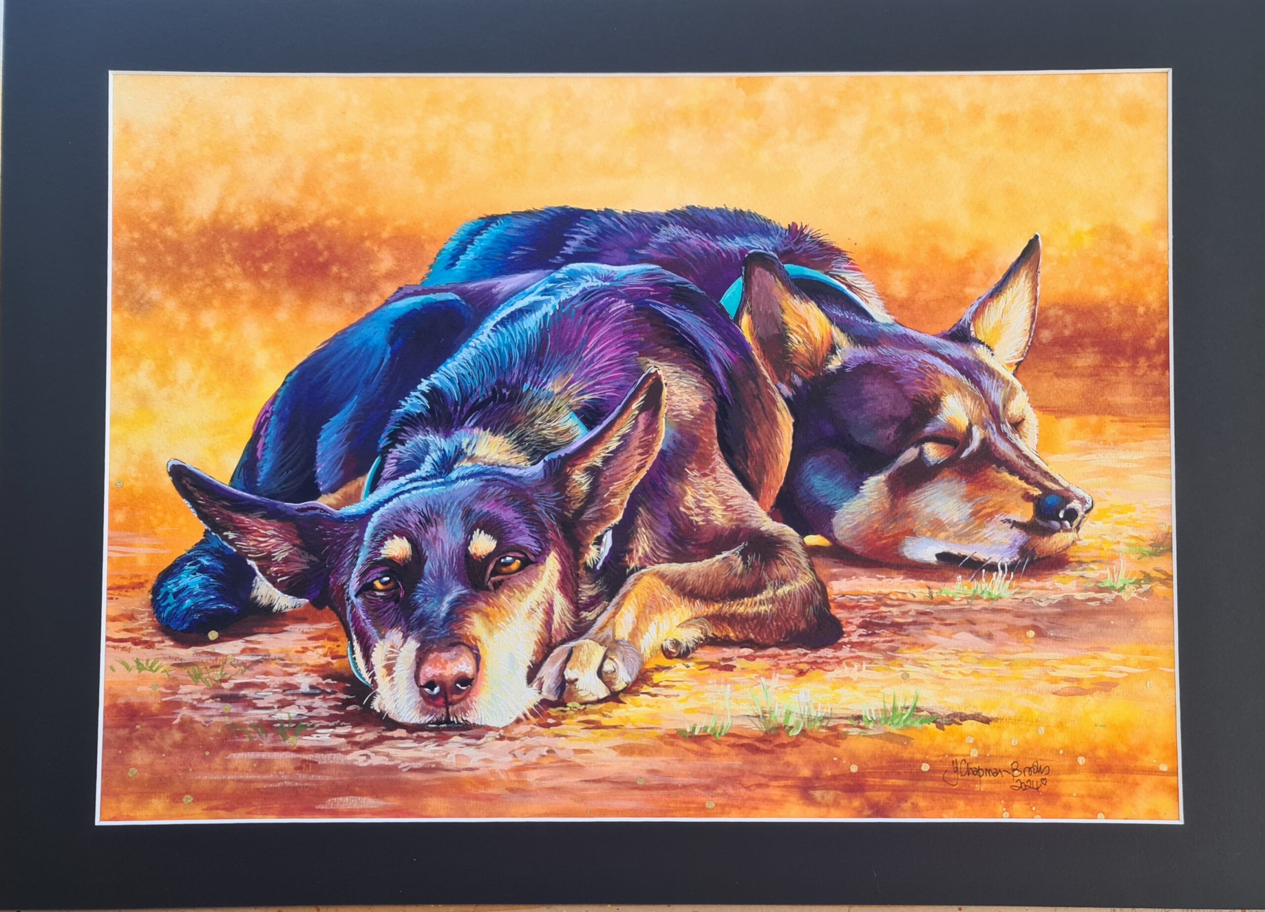
A painting for the Cossack Art Awards 2024 “When the working day is done” Cruise and Diamond Pilbara Working Dogs. This is my watercolour entry for the 2024 Cossack Art Awards. I usually paint the native flora and fauna, but decided this year to do what I do best, domestic animals, and so I went looking for an image, I found one on the “Pilbara Working Dogs” Facebook page and was drawn to this image, as its colours were great to reproduce with my own interpretation. I asked for, and obtained, permission to paint this image and found the dogs names were Diamond and Cruise.  I loved the simplicity of the image  along with the classic red dirt of the West Australian outback.  The sketch was drawn using a grid of 4cm square, so made to fit a large frame, I wasn’t sure if I should use white or black framing at this point.  I put in as much detail as I can then very carefully rub out the grid.  the background is in my classic style, using all the beautiful pindan colours of the outback. Australian Red gold (Art spectrum), Quinacridone Sienna (Daniel Smith,) and Dioxazine Purple (Windsor and Newton,) Lemon Yellow (Art Spectrum,) and Cadmium Yellow (Art Spectrum.) painted in large brush strokes then splattered with the paints to blend, and finally water to produce the lighter areas in the colour blocks. Making a start on Diamond and Cruise I loved the image as it has a definite warm and cool side, so I started with my blues and purples for the cool side first, Phthalo Blue (Art Spectrum), Dioxazine Purple (Windsor and Newton), Indigo ( Art Spectrum), are the main colours used, then as I moved to the warmer side I used Quinacridone Purple (Daniel Smith) with my Quinacridone Sienna  and Australian red gold to make a warmer brown tone, the lighter areas had a touch of the yellows in too.  I block in the areas first with quite bold strokes allowing the paint to bleed and soften, gradually building up a couple of layers until there is definite soft structure to the dog, this is done using wet on wet, but not soaked paper.  that I can follow with my next layers. The lighter areas are just more dilute layers of colour.   Once the first dog is blocked in I work on the second dog, same colours, same technique, leaving the eyes until last on the first dog… I always do the eyes last, it’s just a personal preference.  Finishing Touches In  this close up (Click the image to see an enlarged image) you can see the brush strokes and the different colours used, Some of the Quinacridone Purple is mixed with a little white gouache, and in some of the cooler light areas I have used a Light Cobalt (Windsor and Newton), and had to put in the Bengal Rose gouache (Windsor and Newton)  these can be lightened with a little white,  the Quinacridone Purple with the Light Cobalt  make a nice blue that will cover and blend the colours underneath, as the Light Cobalt is opaque when only slightly diluted. I use a fine Liner brush (or Rigger) number 1 or 2.  In the warmer areas I use the liner brush with the yellows, the Red gold, and the Quinacridone Sienna,  to blend. The eyes are completed last, I paint a layer of the Iris in the Australian Red Gold, then lift a little for the highlight area,  repeat another layer and then make a deeper brown, (by adding purple to my Red Gold)  to paint the shading in the Iris.  The Pupil is painted with almost neat indigo, leaving a small area for the highlight, which I paint with a mix of Phthalo Blue and purple mixed, then lift a bit off the blue/purple mix to leave a glassy eye look.  A dot of white gouache, and an outline of indigo and the eye is complete. TIP: Mixing the Australian Red Gold, or the Quinacridone Sienna with the Dioxazine Purple, (or the Quinacridone Purple) make beautiful browns, more purple – the deeper the brown.  With both dogs completed I used my background colours mixed with a tiny bit of white Gouache  to make details on the ground and to stop the dogs from “Floating” in the painting,  adding directional strokes helps. There is a little bit of Daniel Smith Phthalo Yellow Green  in there too.  Click the image to see and enlarged image. Final touch is a splash, quite literally, of Gold Alcohol Ink. I did use my draughtsman pen too, just to add some directional hair strokes.  Wish me luck!

Read More »