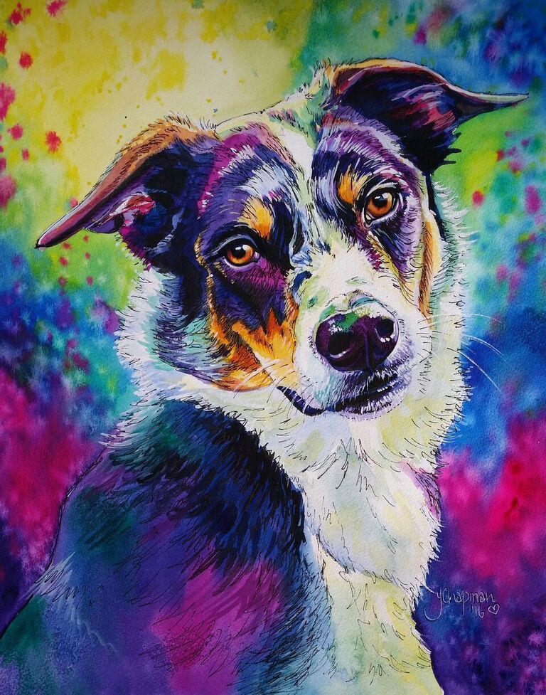


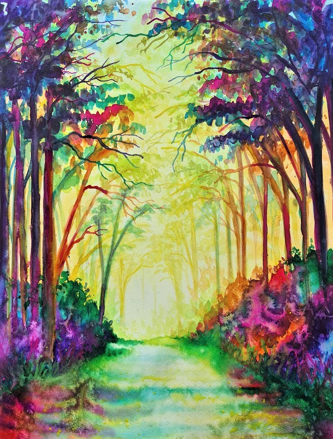
MAKING A LANDSCAPE
I love doing watercolour landscapes using the bright rainbow colouring, using the warm (light) and cool (Shadows) colours. I start very basically with a rough idea of where I want the light, being transparent Yellow is easy to hide with other colours, so this is my first layer, with splashes of water I create the soft mottling look that also helps to add depth to the finished piece.
Here I have used Art Spectrum Lemon yellow with a hint of Windsor and newton Cobalt blue Light.
Step 2
When the first layer is dry I start to add details that will also add depth, I am starting to deepen my colours, but still keeping the warm colour tones. Here the distant branches are starting to take shape using the pale yellow greens, then adding the deeper cooler blue greens you can see how the image starts to move towards the viewer.
Here I use Holbein Bamboo green and Daniel smith Spring green, plus a deeper yellow for the branches.
Step 3
Now my third layer begins to bring the foreground closer using the cooler colours. Simple straight lines form tree trunks. Some painted in the Australian red gold to provide a mid-ground, then the blues and purples for foreground.
A spattering of leaves, careful not to completely block out the background, re painted in a mix of the cool colours, I have used Art Spectrum Phthalo Blue, Windsor and Newton Dioxazine Purple and Windsor and Newton Bengal rose Gouache.
Step 4
Some extra branches have been added in the cool colours, and using wet on wet the ground has been added, keeping the light in the centre and deepening the edges to create a pathway, water has been splashed on the paint as it dries to create my signature mottling.
Finishing
I decided that the painting looked too empty at the top and wanted to create more of a forest walk feel, so I added more leaves and deeper branches to the centre, some splashes of paint and some liquid acrylic iridised paint to add a little bit of shine, then detail in the pathway using a liner brush and a bit of white for the highlights. I have used cool colours, mainly greens to bring the “Light” forward, and a deep blue green for the shadowing. Some of the pink works as a warm tone when mixed with the orange, yet still acts as shadow due to the intensity of the colour compared to the distant paler more diluted colours.