Blog

Watercolours: Lets start with the basics part 2

What to consider when buying watercolour paper PAPER When you start watercolour painting there are so many things to consider, paper becomes a personal preference as to make, surface and weight.  The traditional and most common paper to paint on is Cotton, or cotton and wood pulp (known as RAG content,) these make up most of the papers, but also bamboo and agave are becoming popular. Watercolour paper is heavily sized. This sizing is like a glue that seals the paper and stops its surface absorbing all your paint. Artist quality paper has good archival quality meaning your painting will last. There are different formats available: sheets, pads and blocks. Sheets need stretching, using watercolour paper tape, and can be cut to customised sizes. Pads are usually spiral bound or gummed on one edge, pre-cut to a certain size. Blocks are gummed on 4 sides with a small opening to remove the page once painted, these don’t require stretching and will remain flat when the image is dry.  They have less sheets than the pads but give a stretched paper finish.  Stretching paper prevents the paper cockling (buckling) when dry, it will stick cockle while wet but will dry flat, unstretched paper will cockle and this will remain as the painting dries. WEIGHTS OF PAPER The weight of the paper is important.  Watercolour paper is mostly made in different weights, shown here in gsm (grams per square metre for metric), or British imperial lbs (pounds per ream) The weight indicated on the paper pack or pad is the weight of a full ream, so 140lb is the weight of 500 sheets measuring 22” by 30”. 190gsm/ 90lb, 300gsm/140lb, 425gsm/200lb and 640gsm/300lb. 185/190gsm is thin and needs stretching, 640gsm is similar in thickness to card and therefore doesn’t usually need stretching.   In summary, and as a rough guide, I recommend that paper of or under 140lb needs to be stretched to avoid the paper buckling. PAPER SURFACE What the difference is between NOT, hot pressed & rough papers?  These terms refer to the surface of the paper and its texture. Hot pressed papers have a smooth surface made by passing the paper between two hot cylinders. Great for lots of very fine detail such as botanical paintings.  Cold Pressed or NOT (as in not Hot Pressed) papers have a slightly textured surface which is great for most types of painting.  Rough the roughest surface. This surface is great for painting landscapes where a more textured finish is required. Telling the front from the back of your paper sheets can be difficult, however if your paper has a watermark, it will read correctly on the right side when held to the light. Usually there’s is little difference and either side can be used, but the right side will have more “tooth” or texture. Not every make of paper is the same and you will find a paper you prefer and a weight you are comfortable with. Stretching your paper You will need… a board (MDF 9mm thick is a good size) large enough to take your selected piece of paper. Paper, watercolour  paper, ( as a rule paper over or around 600gms does not require stretching) watercolour stretching paper tape, gummed on one side and easy to tear, KEEP AS DRY AS POSIBLE when stored! Clean sponge Cold, clean Water How to …. Dampen the board by wiping with a damp sponge. Tear selected lengths of tape to fit your paper with overhang, Check your paper for the correct way round, look for embossed paper marks or watermarked name. Soak your paper well on both sides, you can use a hose or watering can for large pieces, or for smaller pieces a sink/bath of cold water, submerge your paper. Drain the excess water slightly. Place paper evenly on the board, some buckling will happen, try to keep it flat but don’t pull the paper flat, or try and smoothen out the buckles.  Dampen the tape with a wet sponge. Don’t soak it, just LIGHTLY wipe with the sponge, don’t rub hard or you will remove the glue. Place the tape so half its width is over the edge of the paper and press down, do this for all four sides. Leave somewhere warm to dry. It should dry nice and taut/flat. To remove your painting from the board when finished, run a cutting blade halfway through the brown tape where it covers your paper, if you give yourself a 5mm margin where there is paper behind your tape, you will find the tape stuck to the board will remove easily .  Excess tape can be removed by soaking it with water, then using a scraper remove the softened tape, wash the board with soapy water to remove the glue, let the board dry.  You are now ready to stretch another piece of paper.     

Read More »

Molly’s Story

This is the story of how were adopted by a beautiful white Boxer dog, and how she loved life and everyone in it.   Years ago, we were having dinner with a family that friends knew, who lived in a big posh house with flashy, very expensive possessions, which they liked to brag about, and who owned a white boxer puppy, her name was Sassy.  We found out later that she was a Christmas gift for their very spoilt daughter, who had got bored when she was no longer a cute little toy.  There was no indication that a dog even lived in this house, no dog bed, bowl, toys, nothing, so I asked the host where this dog was, as I had never seen a white boxer before. She led me outside to the garden and by the shed was a 9 month old dog, certainly not white, more brown and filthy, on a 1 meter chain so tight it was starting to embed into her neck,  and sitting in the doorway of the shed, she had obviously been there for a long time as the 1m space around the doorway was absolutely disgusting, faeces everywhere, old urine stains and stench, and a half empty filthy bucket of water. Her story was that “she’s a digger” and to be taught a lesson was tied up in disgrace!  No! she was a 9-month-old puppy who was being neglected and abused. She was absolutely delighted to see someone …anyone… and jumped up as far as her chain would allow,  her tail wagging furiously, covering me in old faeces and urine, my heart broke. I went inside so angry with how this dog was being treated, and said that we were leaving. On the way home I cried and told Jeff, my late husband,  about this poor dog.  Early the next day we had a phone call from our friends, this family were going to have Sassy put to sleep unless someone took her. Were they honestly hoping someone would just knock on the door and see if they had a dog they didn’t want? We had just lost Spike our 4-year-old Rottie to Meningitis a couple of weeks before, so were still getting over that loss when this request came in. Our friend asked if we could take her and at least find her a good home. Jeff hadn’t seen her so asked what she was like. I said she has a face only a mother could love but there was something beautiful about her,  a very sweet puppy who obviously didn’t cost enough for this family to feel she was worthy. He went to collect her. As soon as Jeff saw her, he was so angry he couldn’t speak, he just picked up the dog and carried her gently,  to our van. As he left the family tried to say goodbye, they were told in no uncertain terms that they were lucky to not be reported to the RSPCA. It took 3 baths to get her clean. And a few more weeks for the smell to leave the van. We gave her a new life and a new name, Molly, AKA Moo Moos She was adorable, playful and very, very loving, she just loved being in our company. She loved to play, chased balls and sticks, ran like the wind and loved everyone. Molly lived until she was 13 and died of splenetic cancer.  She was buried in our garden in Harvey under a blanket of flowers. She is missed and boy, was she loved. Between hello and goodbye there was so much love. 

Read More »
Daisy, watercolours by Yvonne Chapman Brooks

Greyhound love

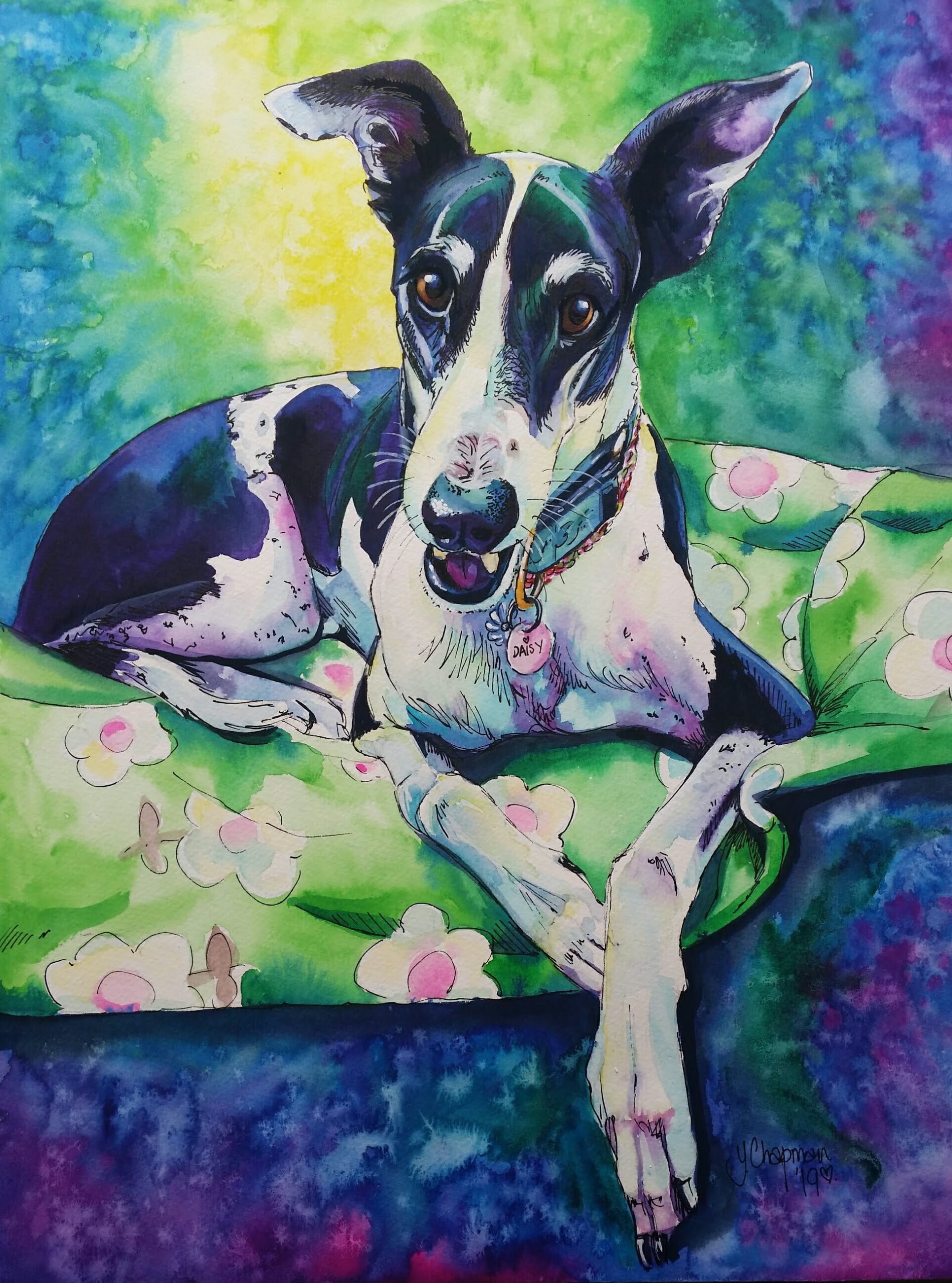
For the love of a greyhound Its no secret that I love Greyhounds. It started 11 years ago when I fostered my very first greyhound, Daisy. It wasn’t going to be a long foster as this little girl completely stole my heart.  She was tiny, small in stature but very thin at just 19kg,  she had been in the regional prison rehabilitation programme where inmates took responsibility of a dog, she did well, and found a forever home….except it wasn’t, it was short lived, one day while her “Dad” was at work, Her “mum” took her back to gap and said she “couldn’t be doing with her” and left.  Daisy was in a terrible condition, extremely thin and withdrawn. GAP took her back and found her a foster home, but she was reactive to cats, so they looked for another, that’s where I come in.  A new beginning Daisy was just 3 years old, she was extremely thin, withdrawn and very quiet. I took her to the vet the day after I fostered her, as her teeth were so rotten you couldn’t get near her for appalling halitosis. I doubt she had ever had a decent thing to chew on or ever been to the vet for a dental, it was awful, her gums were so infected and ulcerated that she could hardly eat, the vet started her on steroids and long term antibiotics before we could even contemplate a dental. I rang GAP,  I said what do you do about Daisy’s teeth, she’s in awful pain, they said, “Nothing until she is adopted”  My response….. “She’s adopted, Im taking her, Now, what are you going to do about her teeth!”  they agreed to pay for her medication and dental work, but it should never had got to this point.  Fast forward and Daisy stayed with me, she is adorable, she was very quiet, obviously some trauma there, as I would find he standing in the middle of the room just like a statue for hours, eventually she would move and sleep. it took nearly 2 years of affection, good food and lots of love to finally find her true personality, then she began to be a dog, a loved pet and to live a pampered life.  Greyhounds in my art I was very taken with the greyhound, a dog whom I had never really considered before as a pet, but I am so glad I went past the Greyhound’s as Pets (GAP) stand at our local agricultural fair, and talked about fostering.  They were elegant, quiet, sleek, athletic and smart. I was hooked, this little girl had me wrapped around her tiny paw, and I began to look at her as my muse. I painted her in so many different ways and gradually the colourful images that I paint today.  she opened my eyes to a whole new world of dog lovers, almost like joining a cult, the greyhound world of rescue is HUGE and they welcomed us and my art with open arms.  I started painting for various rescues, the first main one was “Saving Wilma” on Facebook, a rescued Greyhound who was rescued from a horrific life around the same time as I rescued Daisy, these are some of her portraits below.  “Wilma” Acrylic on canvas, “Goodnight Sweetheart” and “Rainbow Bridge, it’s a beautiful place.” painted after she died.  I painted portraits for fund raising and it went from there. I began to get asked for commissioned pieces and most of them were Greyhounds.  Too many to count Over the last 11 years I have been privileged to be able to paint so many wonderful hounds, every one of them gorgeous and loved. I have used mainly watercolours, but some in acrylics too. I love painting them, they are my favourite, but then every painting I do is a loving tribute to a much loved soul.   Daisy is nearly 14 years old, a miracle considering her heart suffered greatly as a result of her poor dental health, She has one tooth remaining,  and she is on heart medication, lots of heart medication, and is so far managing to love life, albeit at a much slower pace. She has out-lived Otis, my other Greyhound who died in September, and when her time comes I probably won’t have a greyhound again for a while, as we make the most of Shadow, our Mastiff cross. But I will always be a greyhound Mum, a lover of this amazing breed of hound, who’s love is for ever etched in my heart.   Please look at my art and enjoy every portrait ever painted, as well as on my Facebook page… there are many …. sooo many, each one a pleasure to do,  If you are interested in getting your pet painted please reach out and contact me. 

Read More »

One Last Look

One Last Look, a watercolour portrait One Last Look was a painting I recently finished after having a slight doubt in my artistic abilities.  For a while now I have painted pictures that I thought would appeal to the public with a selling point in mind. Each art prize I entered had been largely focused on what would sell rather than what would win a prize.  Earlier this year I entered an art prize in a nearby town, which was surrounded by hype and grandeur, and we had to submit our art work.  On the entry form it stated that if not chosen our work could be nominated to go into an Extension exhibition. I wasn’t particularly interested in entering this exhibition but a friend talked me into it, so I entered two paintings, both which were my usual style of the bright rainbow colouring, featuring emus.  My friend then informed me that around the local circles this exhibition was being touted at the reject exhibition, which we though was rather comical. My work didn’t make the original exhibition but was allowed to enter the “Extension” aka Reject exhibition.  Ok, that didn’t bother me too much, I am under no illusion that my work is better than anyone else’s, but I believe my work is of a high standard and I am good at what I do. I have been painting pet portraits for nearly 20 years now.  All was well until the opening, A few careless words threw me into doubt about my work and I had a real crisis of confidence… the mayor opening stated “This exhibition is for those who didn’t make the cut” I was actually a little insulted by her words, and when I looked at other artists around me it seemed I wasn’t alone! My friend nearly choked on her finger food!  There were several really good pieces by well known artists around the exhibition circuit, and quite a few what I would categorise as student/novice works, so it was a well-rounded exhibition. I am aware that art is sometimes seen as “Elitist” and seems to be getting more and more so, especially in the exhibitions and art prizes these days. Gone are the days of just entering and displaying, now some ask for artist statements and CVS!  I decided to enter an art prize that I have entered, and sold at, on previous occasions, in Dalwallinu in Western Australia.  So I painted “One Last Look” as a statement of This is me, this is what I do, I don’t mind if you don’t want to buy it, but it is ME… and a very good version of ME.  My Therapist. A watercolour study My second entry into the Dalwallinu Art prize is “My Therapist” a watercolour study of my motorbike. It is a 2016 Harley Davidson Softail Deluxe and is my pride and joy, I have painted this in acrylics on canvas but didn’t want to have to display that at the art prize, as items displayed often have to be for sale, so I painted a smaller version  that shows what I am capable of doing. I enjoy the challenge of painting chrome work.  The detail in the spokes and engine leaves me with double vision, but the challenge was to prove I could do it and do it well enough to be judged on its merit.  In future I will be painting what I want to paint for these art prizes, something that reflects on who I am as an artist.    https://www.dalwallinuartsfestival.com/

Read More »
colourful Greyhound watercolour

It’s Christmas!

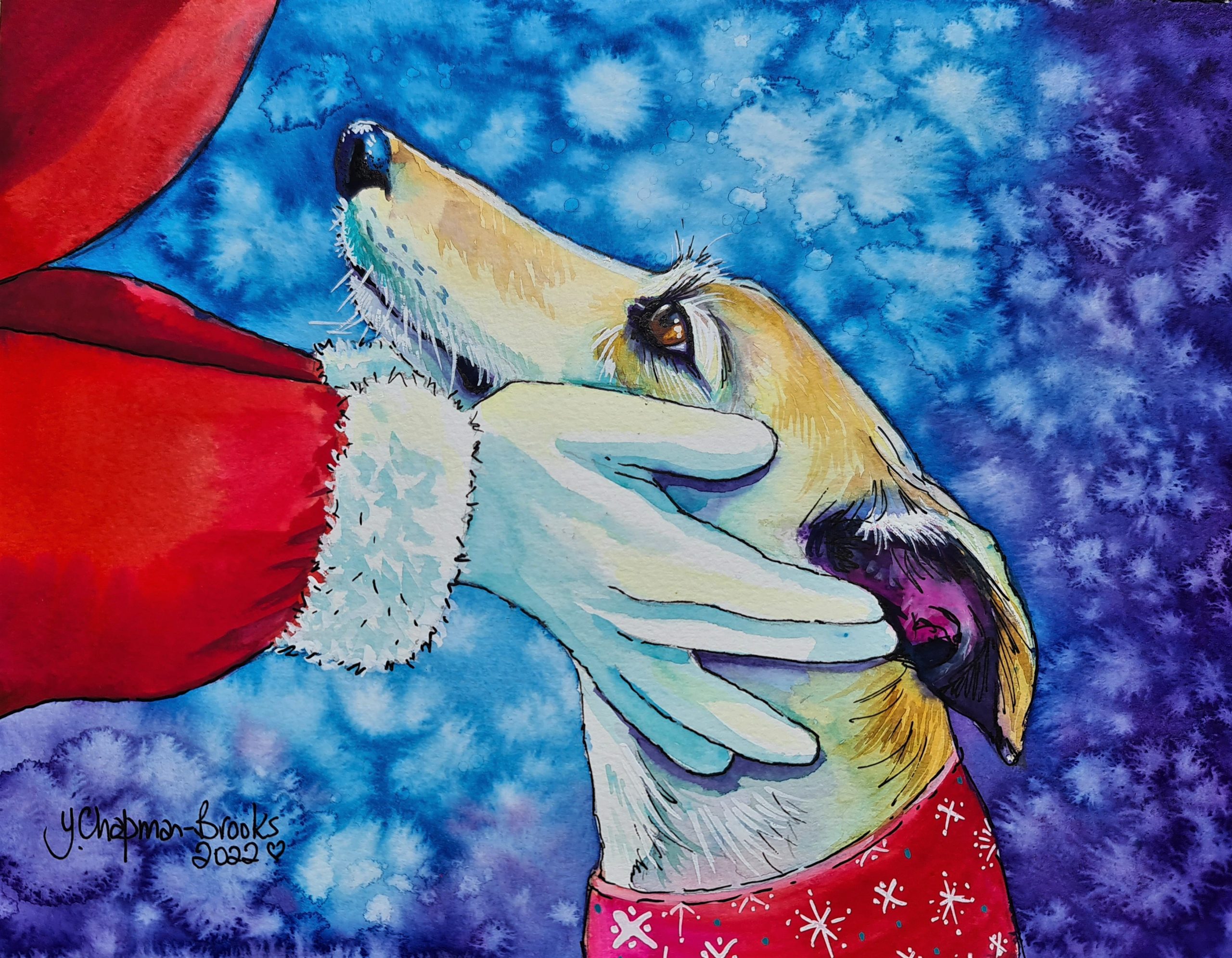
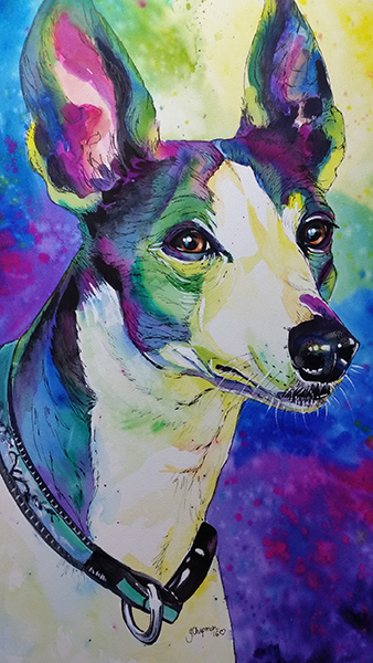
Let us celebrate with a card or two!  It’s that time of year again and once again I have  designs for my colourful Greyhound watercolour Christmas cards.  It is no secret that I adore greyhounds, they are the most adorable creatures, so loving and lazy, the biggest couch potatoes you ever wish to meet, “Gain a Grey, lose a couch!” Well, I have two rescued Greys, Daisy, and Otis, both were my foster fails and now both are 12+ years old and enjoying a very lazy old age. Over the years I have made my images available for a couple of Greyhound rescue organisations, for them to fundraise. I support GAWA (Greyhound Adoptions WA) and BGA (Busselton Greyhound awareness.)  In the past have designed a card of “Granny pants” for “Galgo’s Del Sol” in Spain. In fact, it all started with cards for the Galgo rescue in Spain several years ago, just a generic Galgo, and then I began to design cards for myself. I have also made calendars in the past featuring some of my commissions for the year which have proved popular.  My Christmas card muse is often Daisy or Otis, but I have used others in the past, Maya and Zezan were a friend’s dogs from Holand, they made a beautiful Galgo dreaming card, when I saw the image and with my friend’s permission, I could not resist using it as my card for 2021. This year I have two images. The rescue fundraising card is featuring Otis, the photo was taken on holiday earlier in the year, he does not like his photo being taken and always looks like he has been told off for something, so I painted this image with a destroyed gift or two, I thought the image was perfect for “Dear Santa….define “Good”  I did add a couple of PNG images (the baubles and ribbon) to my original painting to give them a little bit more depth. Otis however is not destructive in any way at all. He is an absolute gem. For the painting that I will use as my own cards this year, I chose a much simpler image, shown at the top of this blog,  that of Santa giving a gentle embrace to a greyhound, a look of love, trust, and hope. I love the simplicity of it. “What would YOU like for Christmas?” I take this opportunity to wish you all a very Happy Christmas, and a happy and prosperous 2023. Paintings shown are:-   What would You like for Christmas?  Galgo Dreaming My Christmas hat Granny Pants GDS Dear Santa….define “Good” Christmas wish list Christmas lights This is for you I found mine!

Read More »
Rumba Watercolour Finished Painting

The making of a portrait

It all starts with a good clear photo, one where the subject is not blurred, not too far away in the photo and preferably in good light, head and shoulder shots that are clear and close are great for detail, when sending me images to paint try not to reduce the size of the image, larger MB are great to work with, screen shots or thumbnails from social media posts are really difficult to work with as the image enlarges or prints really blurry, not good for detail or colouring, and I always feel it shows in a painting. I can montage several images together to form group paintings, but it is always handy to know sizes of the subject in comparison to each other. I draw from photos, I use a grid to enlarge the subjects for my paintings, ensuring accuracy in the finished portrait. I begin with by painting the backgrounds which can be tonal or multi coloured, or occasionally left blank. I let the background dry completely before beginning the subject. Watercolour portraits These take a few days to produce, longer if there is a large amount of detail to include.  I begin with the palest or white areas, when completely dry I work on the darker colourings and shadings.  The eyes are the last to be painted and take several layers to complete to get that glassy, moist look. The final steps are the white gouache and the pen work, for which I use a draftsman pen with Indian ink. Acrylic Painting Acrylic painting layers are more complex and need to dry before adding another layer. Luckily, Acrylic paint is quick drying, unlike oils which have a long curing time.  The first layer is blocking in, just covering the canvas, and getting the basics in colour and shape, the second layer is the beginning of detail, and finally the fine detail and highlights are the last to be added. On this portrait I left the light tan colouring until last, the opposite to the watercolour technique.  Sometimes I will look at a finished painting for a couple of days without touching it, just checking that nothing jumps out at me that requires altering. It takes roughly a week to 10 days curing time, longer for dark paints, for the paint to dry completely, before the varnish can be applied without causing the dark paint to smear over other the colours, when the varnish has cured for a few days, the painting is ready to be shipped or hung on the wall.

Read More »
Rainbow Bridge Watercolour by Yvonne Chapman Brooks

Where it all began

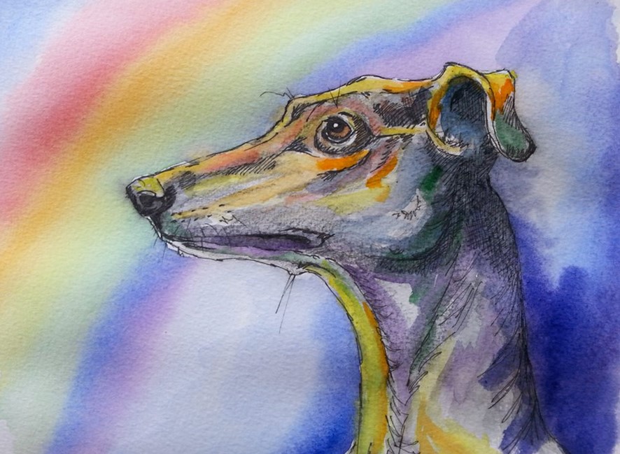
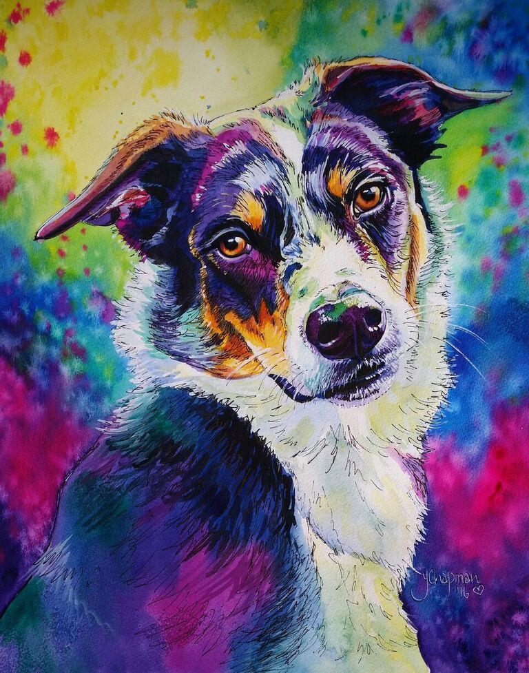
I used to avoid using watercolours, thinking they were boring and “wishy washy”, so my early portfolio consisted of Pastels and Acrylic paintings.  I used to dabble with watercolours but found the method difficult as I had never really been shown how to use them.  In my Graphic Design course, many moons ago, I had been taught the basics, the application but never how to paint with watercolour. That all changed when “Galgo’s Del Sol”, a Galgo rescue in Spain approached me and asked if I would produce an image of a generic Galgo as a condolence card, a “Rainbow Bridge” card, I decided to paint a rainbow without the usual rainbow shape, but rather how the light from the rainbow would look as it reflected on the Galgo. That was it, my first ever Rainbow watercolour! I experimented with colour, anything but the normal colours, and used the warm colours (Yellow, Orange, Yellow Green) on my highlights and cool colours (Blue, Magenta, Blue- Green and Purple) in the shading. It took a few attempts but eventually I was developing my style, my signature colouring. There were a couple of failures, and each painting gradually developed until my style was softer and more blended, but still very bright. Backgrounds Then I began to experiment with my backgrounds, nothing too bright at first, but with splashes of colour and water to create what resembled a hand dyed effect. I continued to experiment with colour in my backgrounds over the years, taking into consideration where the light would come from, and therefore how those colours would reflect on the subject, this continued to evolve until I developed the background style I use today. Challenges The biggest challenge is painting black animals, I don’t use black, I use indigo and purple then the highlights are tones of blue, purple, magenta and even greens. Occasionally highlights of yellow are used on the very bright sheen of the fur and highpoints such as eyebrows and noses. I finish with white gouache for the bright white areas and that all important dot of light in the eye. Black cat, when black isn’t black, and “Daisy” the very first pet portrait I won a First Prize with, using this style.

Read More »