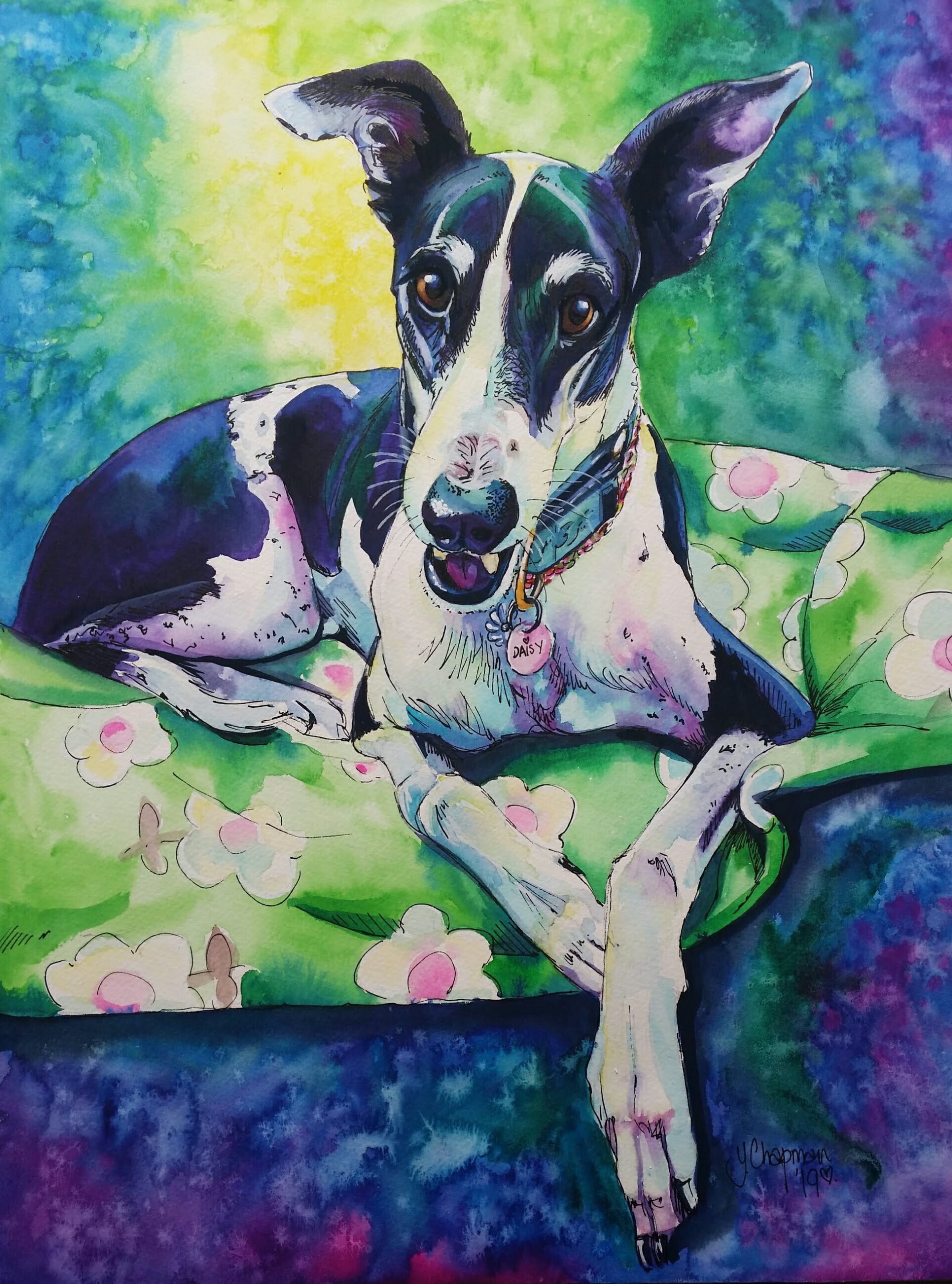
“It’s Time.” Goodnight Daisy
“It’s Time” Goodnight Daisy. Daisy was my introduction to the wonderful world of rescued greyhounds. I adopted her through GAP, Perth, when she was just
“It’s Time” Goodnight Daisy. Daisy was my introduction to the wonderful world of rescued greyhounds. I adopted her through GAP, Perth, when she was just

This is the story of how were adopted by a beautiful white Boxer dog, and how she loved life and everyone in it. Years ago,
On January 7th, 2016 a bushfire was out of control in the hills surrounding Waroona, Yarloop and Harvey. It had started as a lightning strike
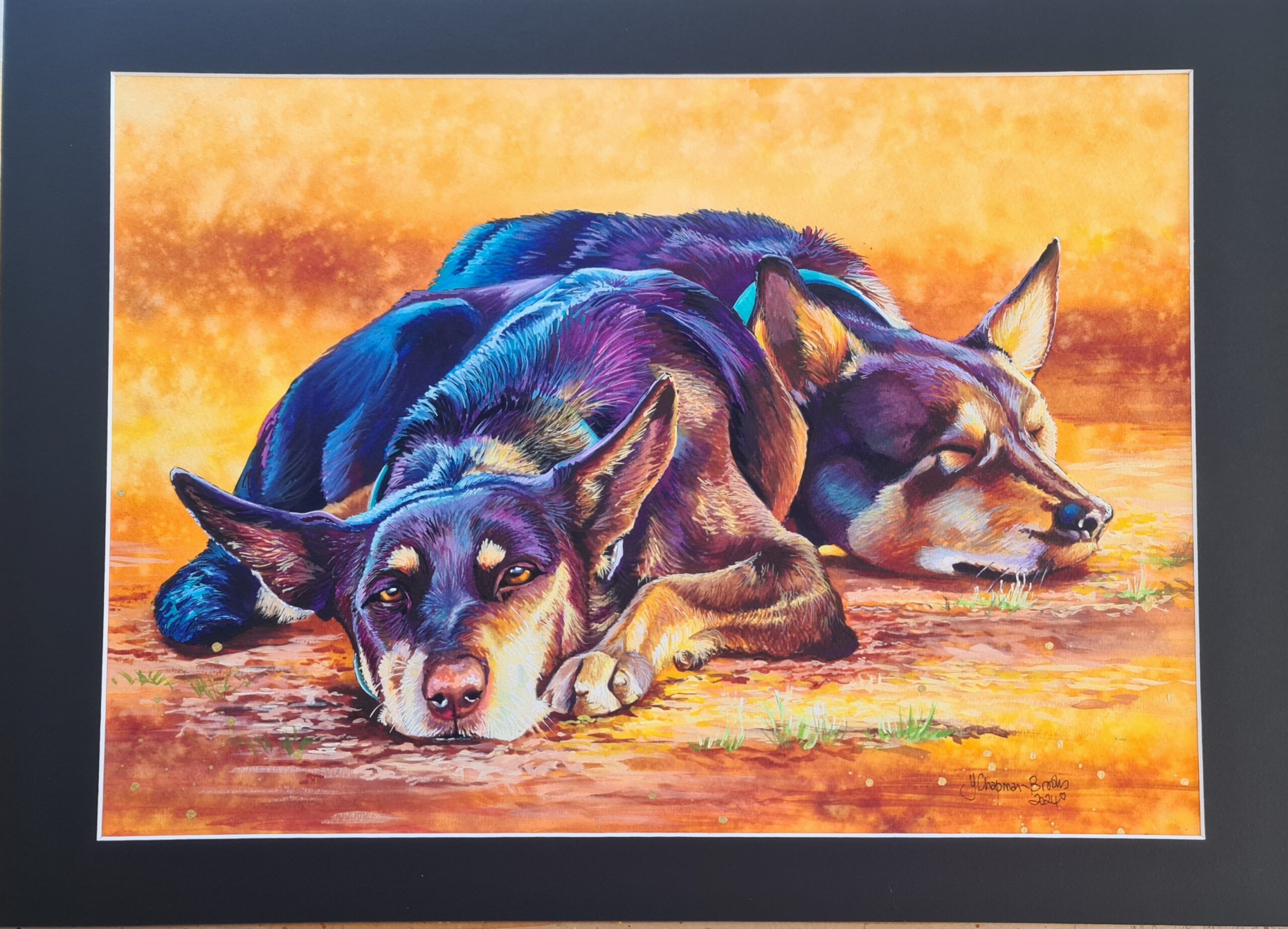
A painting for the Cossack Art Awards 2024 “When the working day is done” Cruise and Diamond Pilbara Working Dogs. This is my watercolour entry
Day One Paint your Pet workshop for march 2024 was another successful weekend, with 4 students all creating wonderful pieces of artwork. My studio is
Making a motorcycle come to life I love the challenge of painting chrome and paintwork. So many reflections, so much detail, I love the challenge
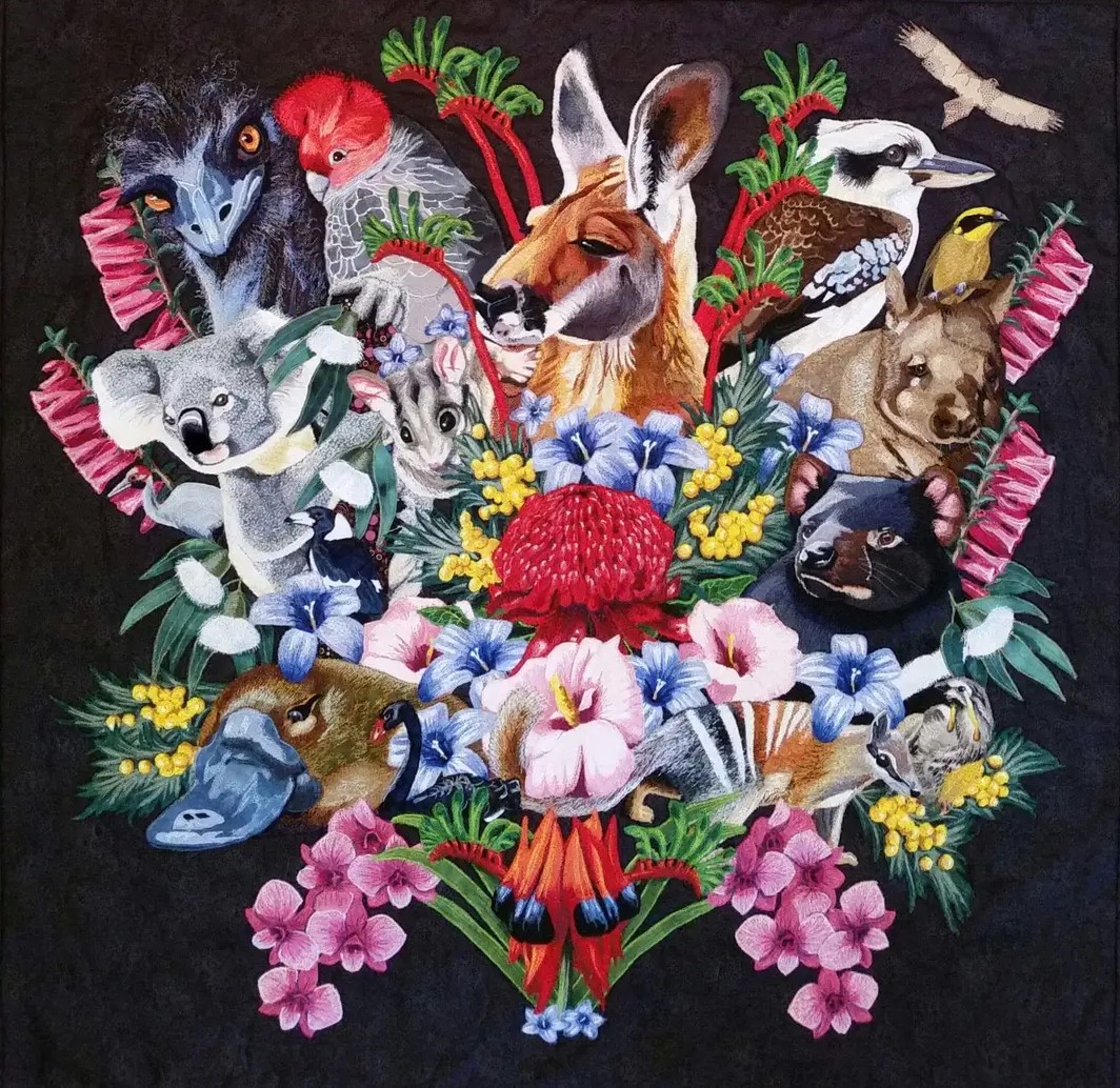
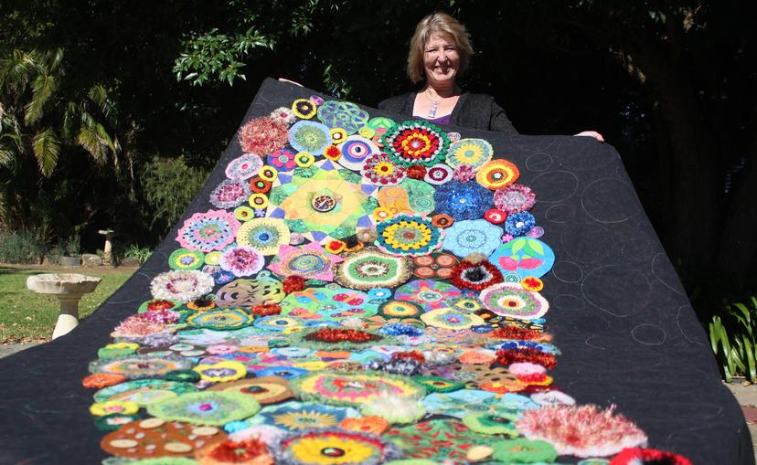
Making a quilt to represent Australia This quilt was made for the Australian Quilt Challenge, theme was Made in Australia, Flora and Fauna, talk about
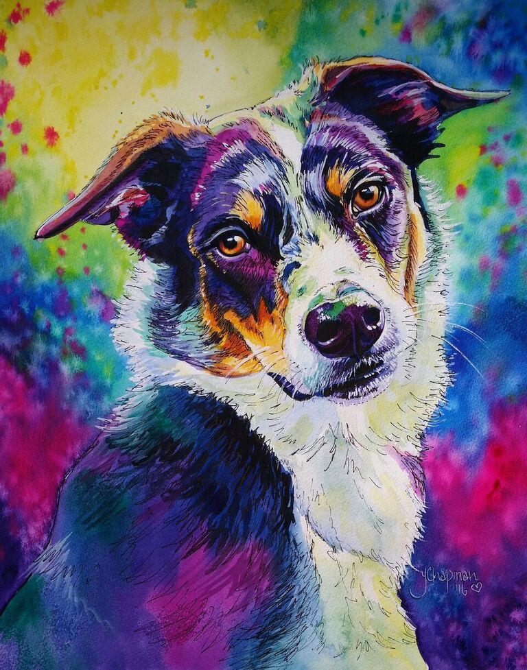
For the love of a greyhound Its no secret that I love Greyhounds. It started 11 years ago when I fostered my very first greyhound,

Time to buy your Christmas cards Its time to think about the festive season again, I’m sure it comes around quicker every year. This year