Blog

Paint your Pet Workshop May 2023

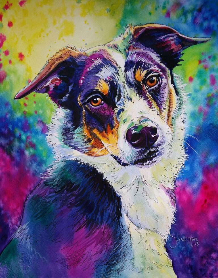
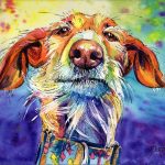
 “Paint your pet in Watercolour,” held in May 2023, was once again a very successful workshop. A beautiful weekend was forecast so the stretching paper demo was able to dry quickly. I usually have about 4 workshops per year,  since the completion of my home studio, I can hold these for about 6 people.  The workshops are split into two days, the first day is a demonstration of the drawing techniques required. I teach  enlarging from a photograph using a simple acetate grid. This is such a handy technique to master as you can not only enlarge but reduce in size too. The simple formula works for simple enlargement of A4 to A3, or even up to the side of a house if necessary! I demonstrated a couple of images, a black greyhound and a black Red Tailed Cockatoo,  the main aim of these workshops is to show how warm and cool colours can be used to create the portraits. Warm colours depict the highlights and cool colours depict the shadows. I chose to demonstrate a bright Rainbow background, and a more natural tonal effect.  The colours I use never change, Lemon Yellow, Australian Red Gold, Bengal Rose (Gouache), Phthalo blue, Bamboo Green (Holbein brand is the nicest blue green I have found as it is bright and beautifully transparent), Indigo and Dioxazine Purple.  Most of these colours can be found in either the Cotman tube ranges (which I recommend for beginners as they are lovely, clear colours, but a cheaper version than the artist quality brands), or the Windsor & Newton range, the other brand I like to use is Art Spectrum, I use tubes of paint verses the pans, as the technique requires large coverage of areas in a short time frame. The final touch is a small amount of titanium white gouache, brilliant for the dots in eyes or stray white hairs, unlike the Chinese White watercolour, which I find is more of a milky glaze than a bright white.  Day 1 Once the outline is drawn with as much detail as possible, we move on to the background. The warm colour area depicts the light source. It is important not to mix certain colours such as the green and Bengal rose as they go very muddy,  not a nice combination, therefore care and thought are needed when placing colours together. I tell the students to think about what colour mixes to what, to get the next colour, for example yellow to red (in this case the Bengal Rose) gives you the oranges.  Day 2 Day two is the fun bit, the actual painting of the subject. The students all did such a great job of their backgrounds, and its not as easy as it looks! There are several different ways of painting with watercolours, the main two are wet on wet and wet on dry, the background is the wet on  wet, but other things affect the process, such as the weather, too hot and it dries way too quickly, to humid or damp and the water takes too long to dry leading to muddy blending. The splashes of paint, that help to blend the colours, are added in several layers as the paint dries. I teach several effects at this stage, if you want to know more….. book into a workshop! How awesome are these! All the examples of finished work are amazing, they should be very proud of their work. .  Even though there is a common theme, everyone’s piece is so different. If the student doesn’t want a really bright image, the colours can be toned down or used in other ways and yet still look “Normal” to the eye. It’s amazing how the eye and brain evaluate the images. You almost don’t notice the bright green or pink that are subtly used in the subject on first glance.  Sadly one of the students couldn’t complete her second day, so I finished her painting off for her, she had made such a tremendous start it seemed unfair that she go home with only half a dog, and it was another example for me to  demonstrate.  I use my images reverted into monochrome as examples to show how the colours really look as tones. This is why the brain usually accepts them as  a “Black dog” instead of a “blue and yellow dog”. I know which of the paints I use have similar tonal values when dry, so I can swap out the Phthalo blue with green, or the magenta with purple.  By the end of the weekend there has been some amazing art created, each one unique, and everyone seems to take away something different from the experience, whether it be a new skill, or a new understanding of colour.  I just hope that they all take away a memory of a fun weekend,  trying something new, if they change their colour palette that’s Great! If they realise what colours can/can’t be mixed that’s great too.  I hope they go away with new ideas and a fun take on a technique. It’s all about learning and enjoying the experience…. having a dabble in a safe space. There’s no right and wrong with art, just a different perception. 

Read More »
Watercolour Rainbow landscape almost completed watercolour layering

Landscape layering

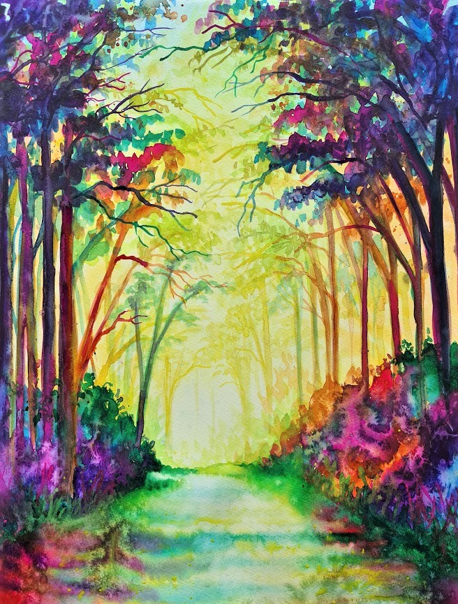
MAKING A LANDSCAPE I love doing watercolour  landscapes using the bright rainbow colouring, using the warm (light) and cool (Shadows) colours. I start very basically with a rough idea of where I want the light, being transparent Yellow is easy to hide with other colours, so this is my first layer, with splashes of water I create the soft mottling look that also helps to add depth to the finished piece. Here I have used Art Spectrum Lemon yellow with a hint of Windsor and newton Cobalt blue Light. Step 2 When the first layer is dry I start to add details that will also add depth, I am starting to deepen my colours, but still keeping the warm colour tones. Here the distant branches are starting to take shape using the pale yellow greens, then adding the deeper cooler blue greens you can see how the image starts to move towards the viewer. Here I use Holbein Bamboo green and Daniel smith Spring green, plus a deeper yellow for the branches. Step 3 Now my third layer begins to bring the foreground closer using the cooler colours. Simple straight lines form tree trunks. Some painted in the Australian red gold to provide a mid-ground, then the blues and purples for foreground.  A spattering of leaves, careful not to completely block out the background, re painted in a mix of the cool colours, I have used Art Spectrum Phthalo Blue, Windsor and Newton Dioxazine Purple and Windsor and Newton Bengal rose Gouache. Step 4 Some extra branches have been added in the cool colours, and using wet on wet the ground has been added, keeping the light in the centre and deepening the edges to create a pathway, water has been splashed on the paint as it dries to create my signature mottling. Finishing  I decided that the painting looked too empty at the top and wanted to create more of a forest walk feel, so I added more leaves and deeper branches to the centre, some splashes of paint and some liquid acrylic iridised paint to add a little bit of shine,  then detail in the pathway using a liner brush and a bit of white for the highlights. I have used cool colours,  mainly greens to bring the “Light” forward, and a deep blue green for the shadowing. Some of the pink works as a warm tone when mixed with the orange, yet still acts as shadow due to the intensity of the colour compared to the distant paler more diluted colours.

Read More »