Blog

My Art Journey begins

London Road School of Art and Design, Northwich, Cheshire My art journey begins as a teenager ready to leave school after my O’ levels in 1978, I was interviewed by our school careers advisor.  He asked “What was my typing and shorthand like?.” Pretty rubbish, “So what did I think about hairdressing?”  Was this it… secretary or hairdresser…was this all a Grammar school Careers Advisor could recommend? “What was I good at? What did I love doing?”  Well that was easy, Art… loved it! I had been creating art and craft all my life, thanks to good old “Blue Peter” and “Vision On”.  Valerie Singleton and Tony Hart had a lot to answer for regarding my love of art. “Well… go to art school then! Here’s some numbers to ring and the names of people to speak to. Bye. Next!” So I went home, not offended by the lack of enthusiasm of my careers advisor, but with ideas of going to art college. On the final School Parents evening Mum asked my art teacher if she thought I’d get in to Art College, she replied “Oh yes the standard’s not that high!”well obviously my standard got me though the interview,  So London Road School of Art and design, Northwich,  Cheshire… here I come!I attended a 1 year Ground Course, where we covered everything, art, design, 3D design, woodwork, metalwork, photography,  ceramics, printing, and life drawing. I took my A level art a year early and passed.This lead to a second year at London Road on the  on the Foundation Course, covering everything again in more depth and with art history added. It was a great 2 years. I learnt so much, more than I ever imagined I could do. I loved it. The lecturers were amazing, approachable and enthusiastic.  This course prepared me for Polytechnic.    Coventry Lanchester Polytechnic Art and Design building Priory Hall student accommodation, Coventry Lanchester Polytechnic Coventry Cathedral UK I decided to study Graphic Design, against my tutors advice, he wanted me to go for 3D design, but I was accepted to my first choice Coventry Lanchester Polytechnic.  I was born in Coventry so felt I was going to a place that meant something to me, and the course looked promising.  I was living on the top floor of the Priory Hall G block, one of three accommodation blocks. I had great views over Coventry and the swimming baths behind. we were right opposite the Coventry Cathedral ruins, Bombed during WW2, and the new Cathedral. The next 3 years went in a flash. I made life long friends and learnt skills that I would use throughout my artistic career. I think perhaps a fine art degree would have been more suited to me, as I found graphics very rigidly structured and to me,  claustrophobic.  I didn’t always create  typical “Graphic Design” projects and was not encouraged to colour out side of the lines as I thought outside of the box, as it were.   I found a few of the tutors unhelpful in comparison to my foundation  course, they were hard to please and to find having set the brief, then disappeared. By the end of my 3 years I felt rather lost and disillusioned. One thing it did do was teach me a myriad of drawing, illustration and technical skills. The course covered computer design but using punch cards. It was 1980, no computer involvement in the design process in those days. I didn’t do very well at that part of the course. There was no quick way to print either.. we had to  hand set our typefaces for printing, we had Typeface books with different size type face so we could trace words on to layouts. We learnt about using ems and ens, point sizes and spacing, plus hundreds of typefaces to think about. It wasn’t easy, but I remember a sense of achievement when you saw the printed page., until you noticed a letter the wrong way around….I  passed my 3 year course with a BA(hons)  Unfortunately in 1983 jobs were scarce. In 1985 I swapped career paths and started a State Registered Nurse training. I dabbled with various art and crafts throughout the next few years, and emigrated to Australia as a Registered Nurse, with a good hobby. Unfortunately my health meant I had to stop work,  and art became my lifeline and my saviour. I think my style now is best described as illustrative, and the skills I use today were definitely founded in those 5 years study at art college.  I now teach art to a small group of ladies, and do my commissions and workshops, If I had my time again I would have gone on to do my teaching degree, straight after my art degree, and looked to teach art at polytechnic or university.  I have the best hobby I could ever wish for. I found that animals were my best work, and I love peoples response to commissions I do for them. My style has adapted over the years, it means I never get bored. I always have something I can do to fill my time, that is fun and rewarding. 

Read More »
Rumba Watercolour Finished Painting

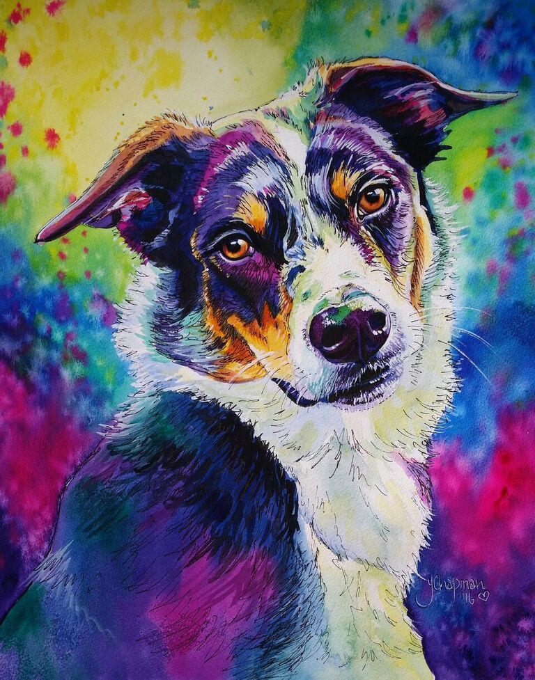
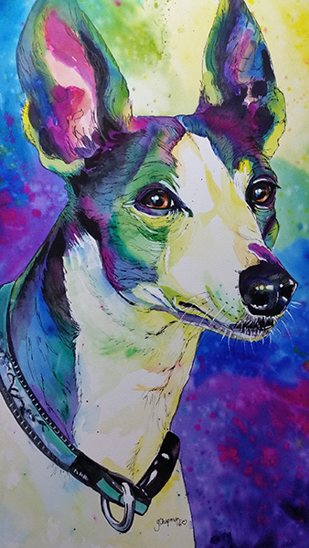
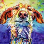
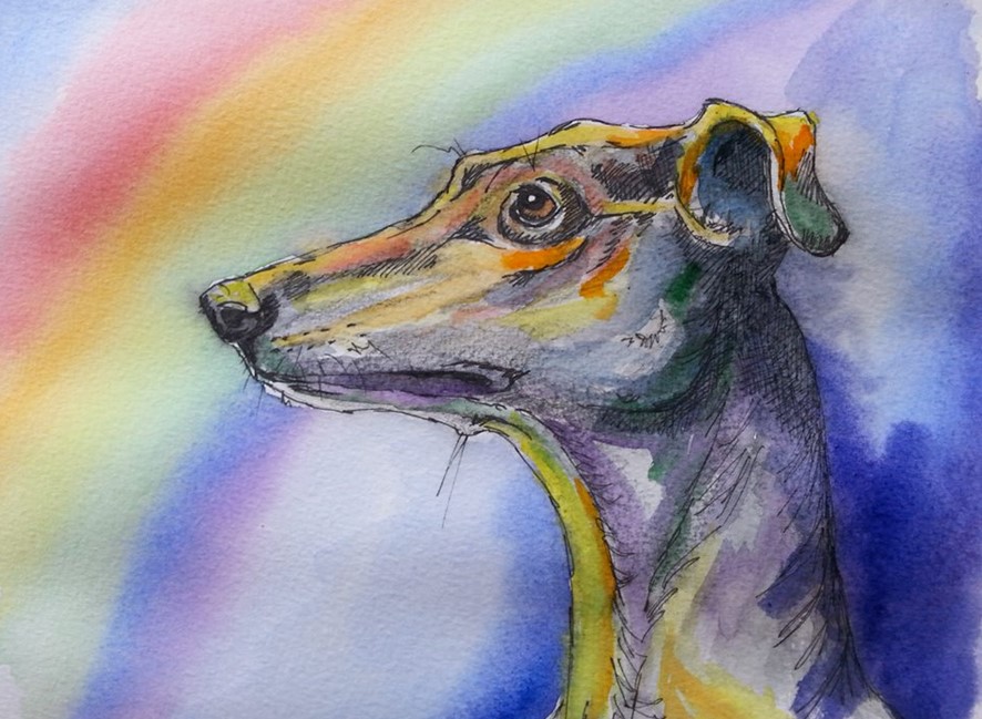
The making of a portrait

It all starts with a good clear photo, one where the subject is not blurred, not too far away in the photo and preferably in good light, head and shoulder shots that are clear and close are great for detail, when sending me images to paint try not to reduce the size of the image, larger MB are great to work with, screen shots or thumbnails from social media posts are really difficult to work with as the image enlarges or prints really blurry, not good for detail or colouring, and I always feel it shows in a painting. I can montage several images together to form group paintings, but it is always handy to know sizes of the subject in comparison to each other. I draw from photos, I use a grid to enlarge the subjects for my paintings, ensuring accuracy in the finished portrait. I begin with by painting the backgrounds which can be tonal or multi coloured, or occasionally left blank. I let the background dry completely before beginning the subject. Watercolour portraits These take a few days to produce, longer if there is a large amount of detail to include.  I begin with the palest or white areas, when completely dry I work on the darker colourings and shadings.  The eyes are the last to be painted and take several layers to complete to get that glassy, moist look. The final steps are the white gouache and the pen work, for which I use a draftsman pen with Indian ink. Acrylic Painting Acrylic painting layers are more complex and need to dry before adding another layer. Luckily, Acrylic paint is quick drying, unlike oils which have a long curing time.  The first layer is blocking in, just covering the canvas, and getting the basics in colour and shape, the second layer is the beginning of detail, and finally the fine detail and highlights are the last to be added. On this portrait I left the light tan colouring until last, the opposite to the watercolour technique.  Sometimes I will look at a finished painting for a couple of days without touching it, just checking that nothing jumps out at me that requires altering. It takes roughly a week to 10 days curing time, longer for dark paints, for the paint to dry completely, before the varnish can be applied without causing the dark paint to smear over other the colours, when the varnish has cured for a few days, the painting is ready to be shipped or hung on the wall.

Read More »
Rainbow Bridge Watercolour by Yvonne Chapman Brooks

Where it all began

I used to avoid using watercolours, thinking they were boring and “wishy washy”, so my early portfolio consisted of Pastels and Acrylic paintings.  I used to dabble with watercolours but found the method difficult as I had never really been shown how to use them.  In my Graphic Design course, many moons ago, I had been taught the basics, the application but never how to paint with watercolour. That all changed when “Galgo’s Del Sol”, a Galgo rescue in Spain approached me and asked if I would produce an image of a generic Galgo as a condolence card, a “Rainbow Bridge” card, I decided to paint a rainbow without the usual rainbow shape, but rather how the light from the rainbow would look as it reflected on the Galgo. That was it, my first ever Rainbow watercolour! I experimented with colour, anything but the normal colours, and used the warm colours (Yellow, Orange, Yellow Green) on my highlights and cool colours (Blue, Magenta, Blue- Green and Purple) in the shading. It took a few attempts but eventually I was developing my style, my signature colouring. There were a couple of failures, and each painting gradually developed until my style was softer and more blended, but still very bright. Backgrounds Then I began to experiment with my backgrounds, nothing too bright at first, but with splashes of colour and water to create what resembled a hand dyed effect. I continued to experiment with colour in my backgrounds over the years, taking into consideration where the light would come from, and therefore how those colours would reflect on the subject, this continued to evolve until I developed the background style I use today. Challenges The biggest challenge is painting black animals, I don’t use black, I use indigo and purple then the highlights are tones of blue, purple, magenta and even greens. Occasionally highlights of yellow are used on the very bright sheen of the fur and highpoints such as eyebrows and noses. I finish with white gouache for the bright white areas and that all important dot of light in the eye. Black cat, when black isn’t black, and “Daisy” the very first pet portrait I won a First Prize with, using this style.

Read More »